Glo CryoA brand built on contrast. Cold and heat. Dark and light.

Glo Cryo entered a wellness market where every brand speaks the same language: clean, clinical, approachable. The opportunity was to claim the space none of them occupy.
The opportunityThe insightMost wellness brands ask you to relax. The most committed people don't want to relax. They want to recover, perform, and come back stronger. Contrast, restraint, and intention speak to that person.
An eclipse-inspired identity built on shadow, precision, and the tension between cold and heat, dark and light. The brand lives in that threshold moment: serene on the surface, transformative underneath.
The SolutionBrand Identity
Art Direction
Web Design
Environmental Branding
my role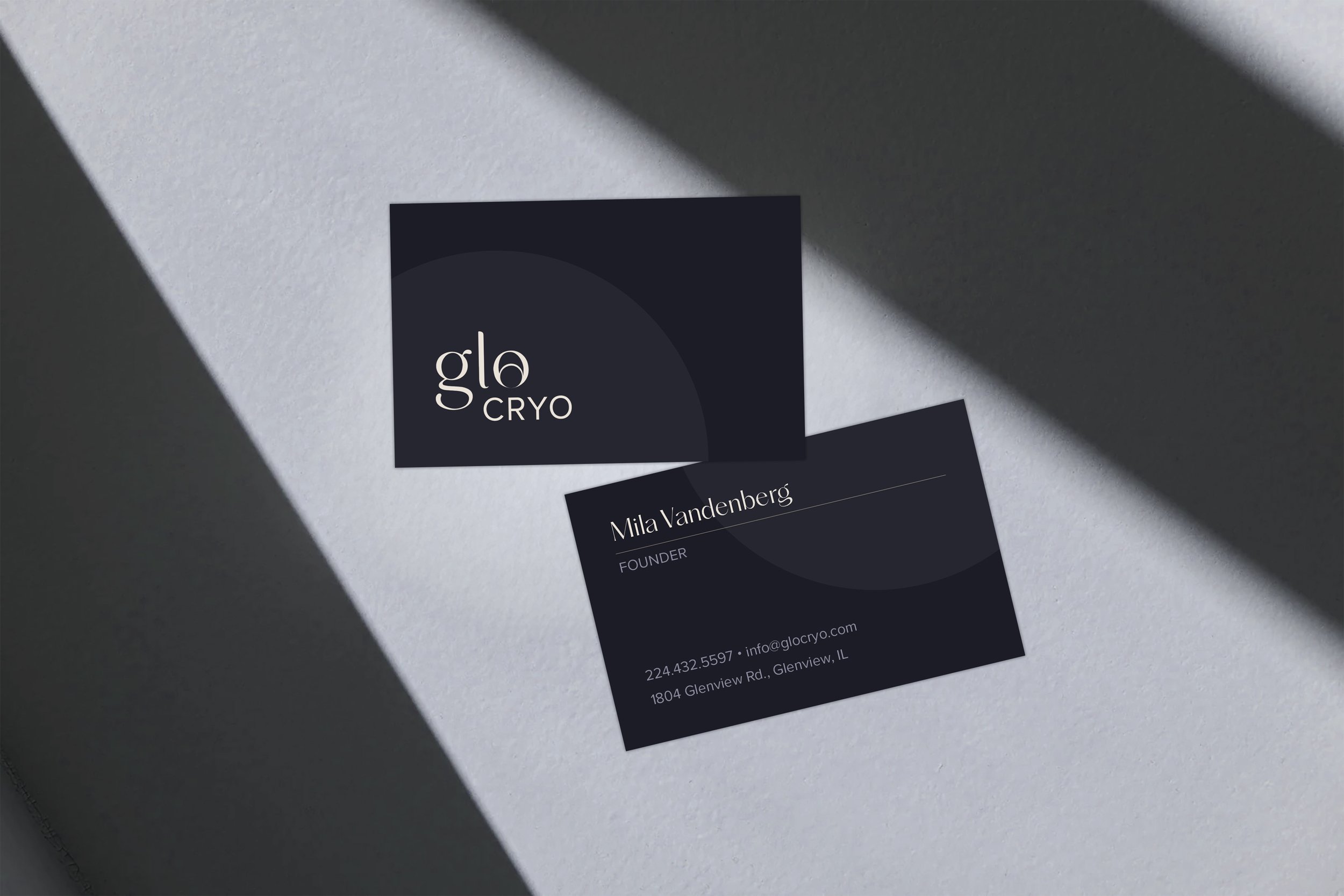
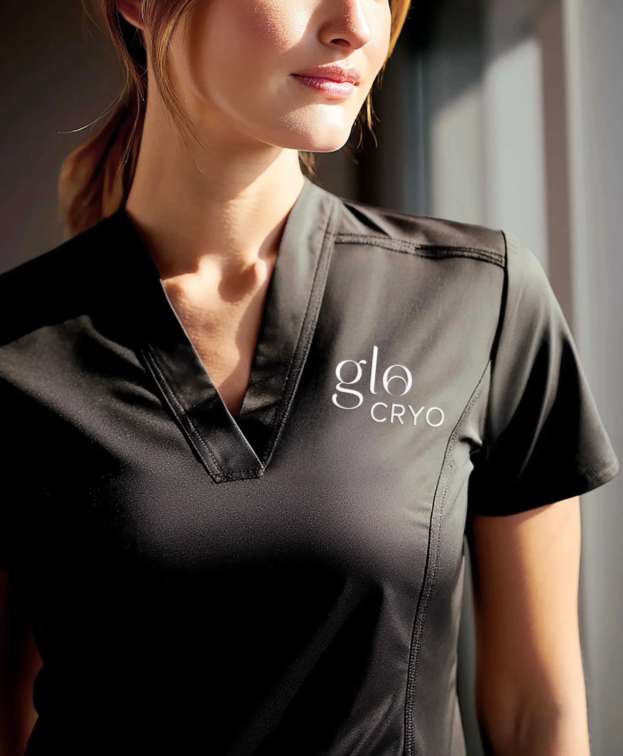

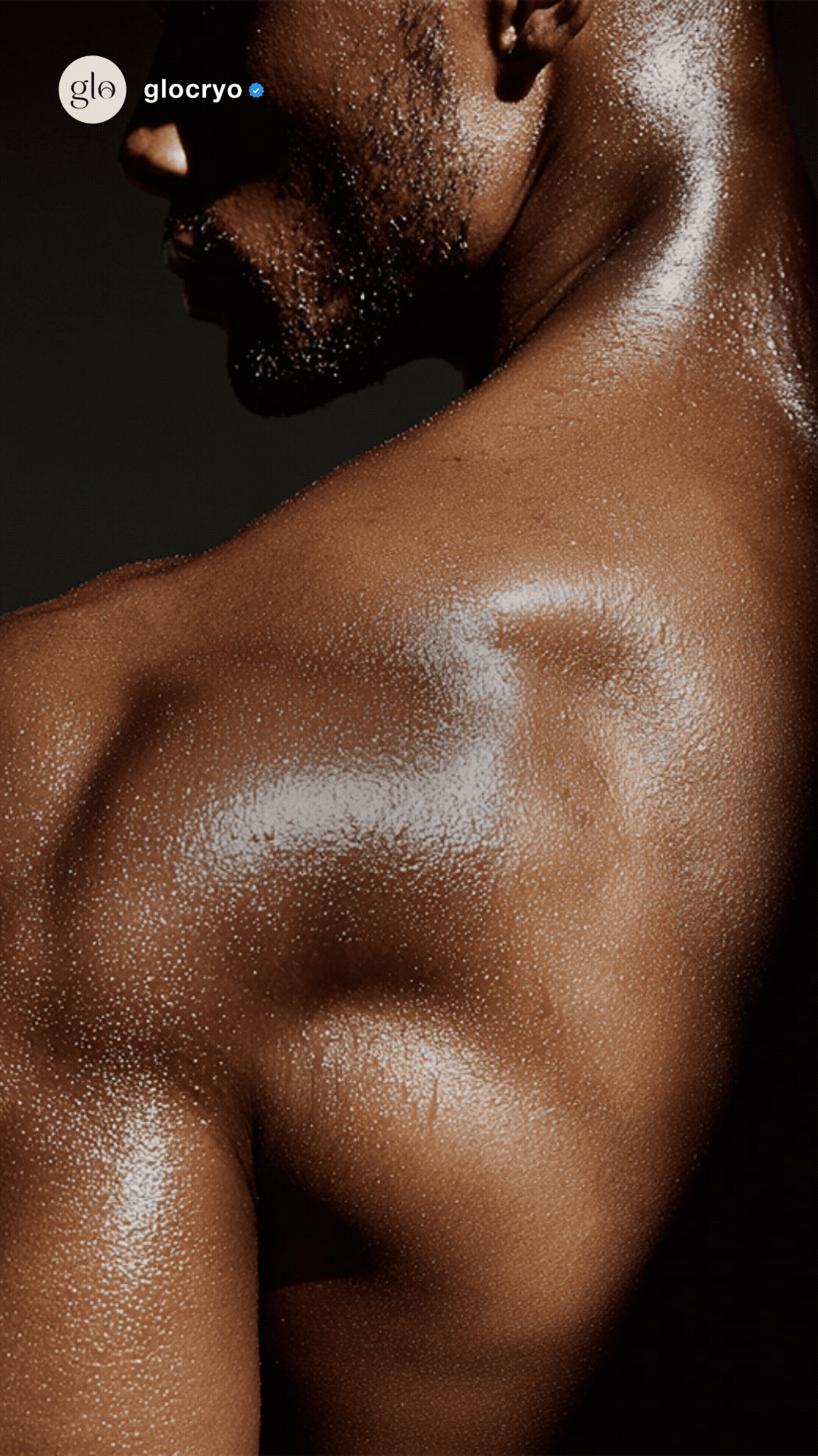
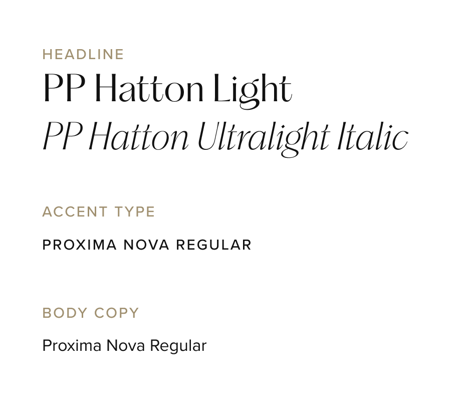
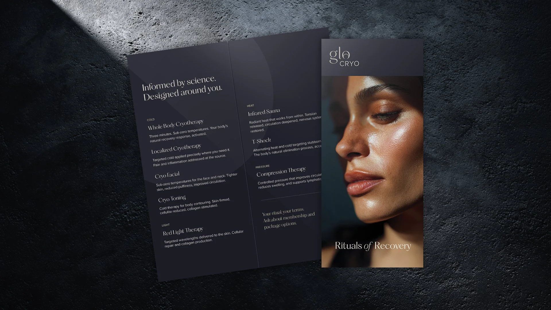
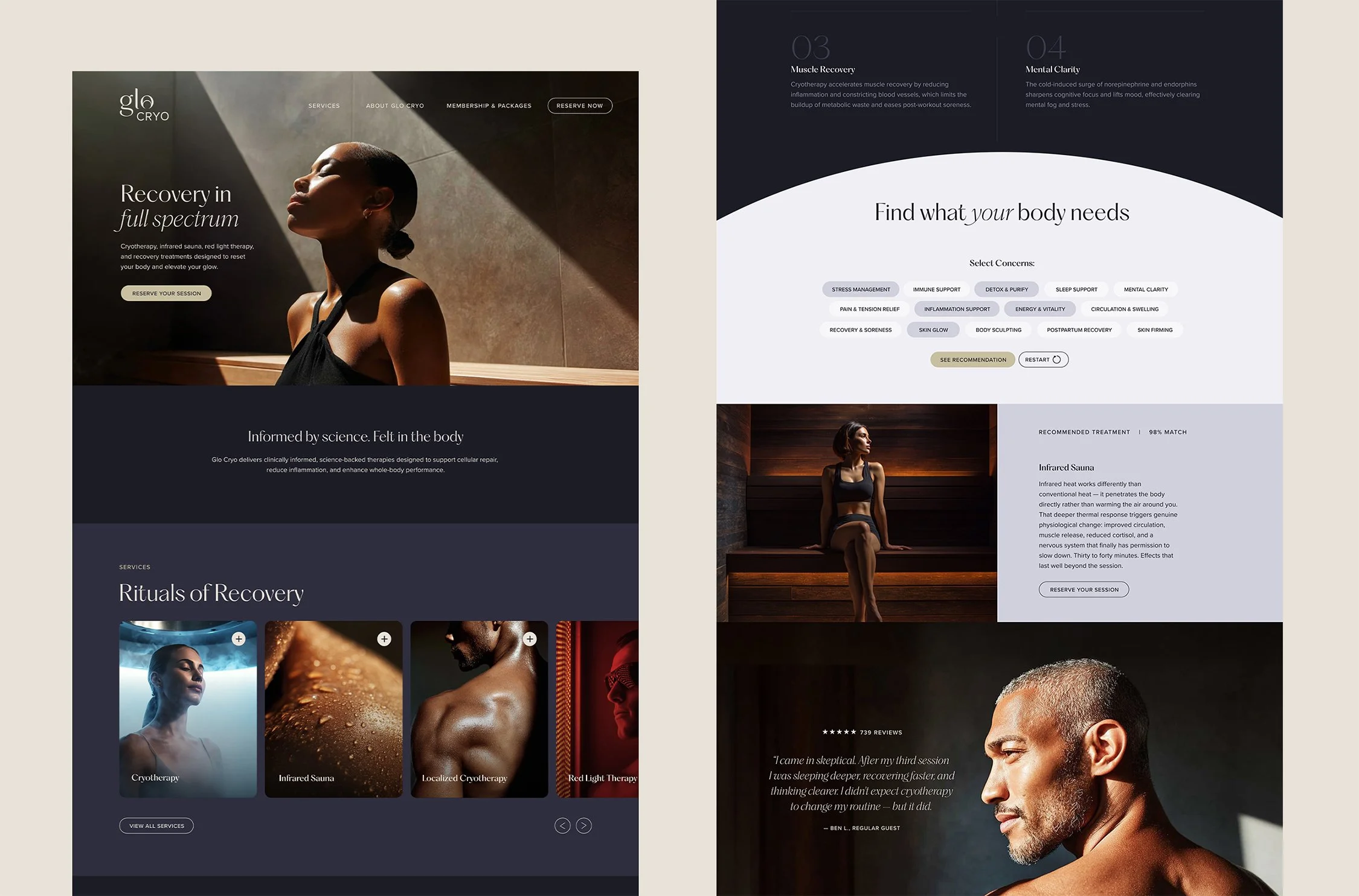
A near-black palette anchored by a corona gold accent creates a visual language that is precise without being clinical. Typography pairs editorial serif with clean sans, shifting between feeling and function. Photography is directional and deliberate, each image a threshold moment that mirrors the eclipse at the heart of the brand.
design approach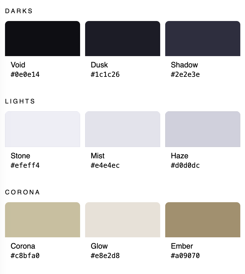
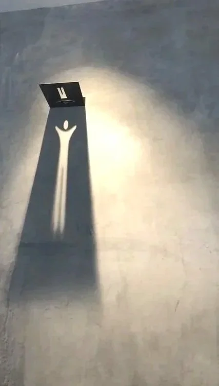
The eclipse installation translates the brand into architecture. A backlit circle casts a corona of warm light against deep navy, while dark marble and concrete reference the contrast between cold and heat at the core of the experience. The same mark scales down to room signage, each numbered disc glowing with the same corona effect in the hallway. Even the wayfinding casts a shadow, light and darkness doing the work of direction.
Environmental Branding Concepts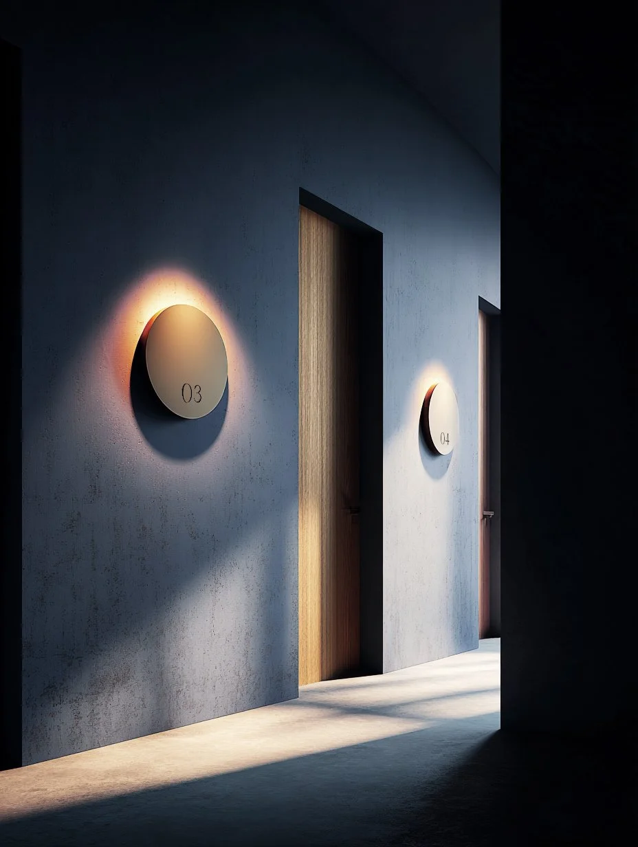
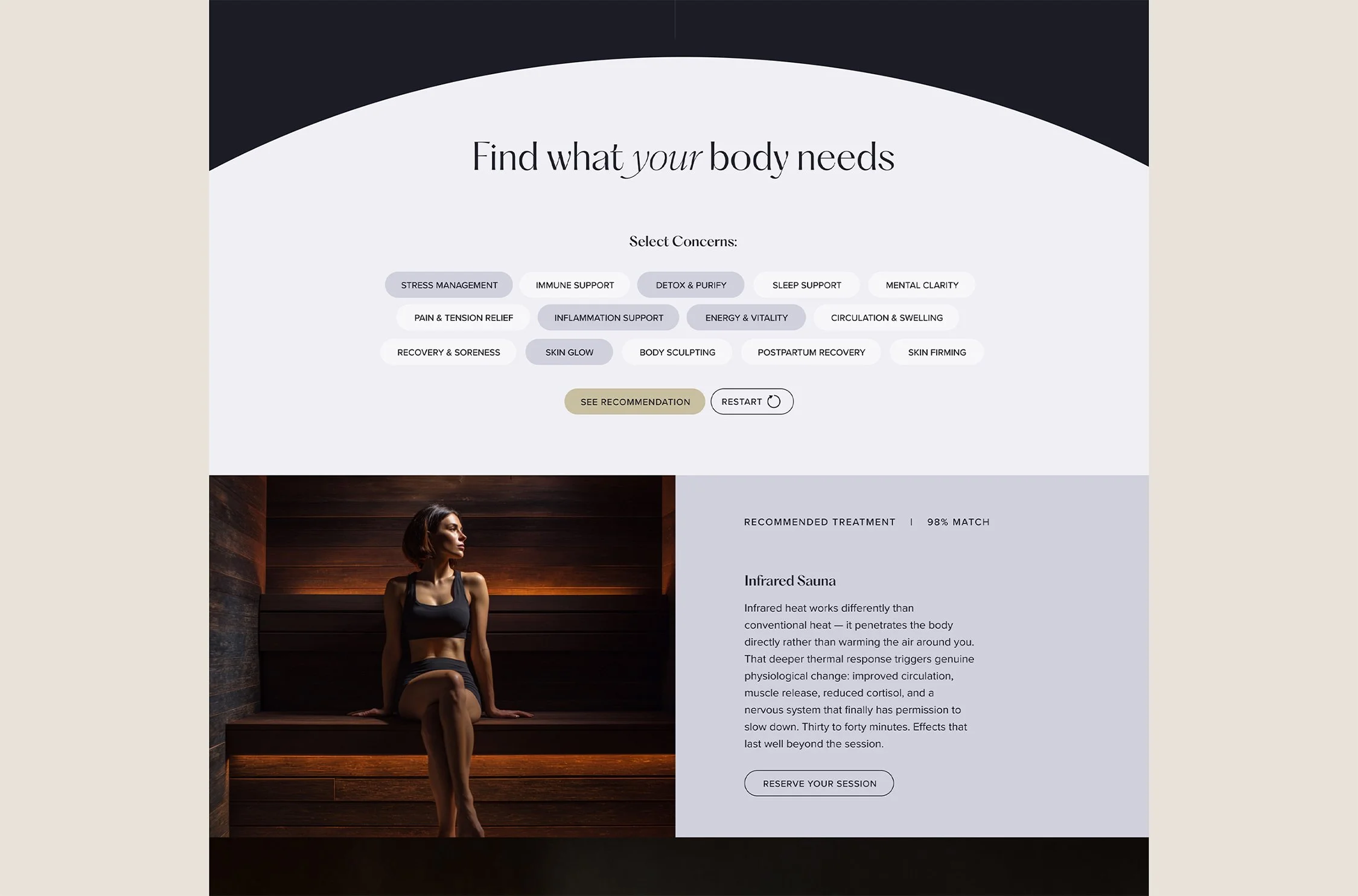
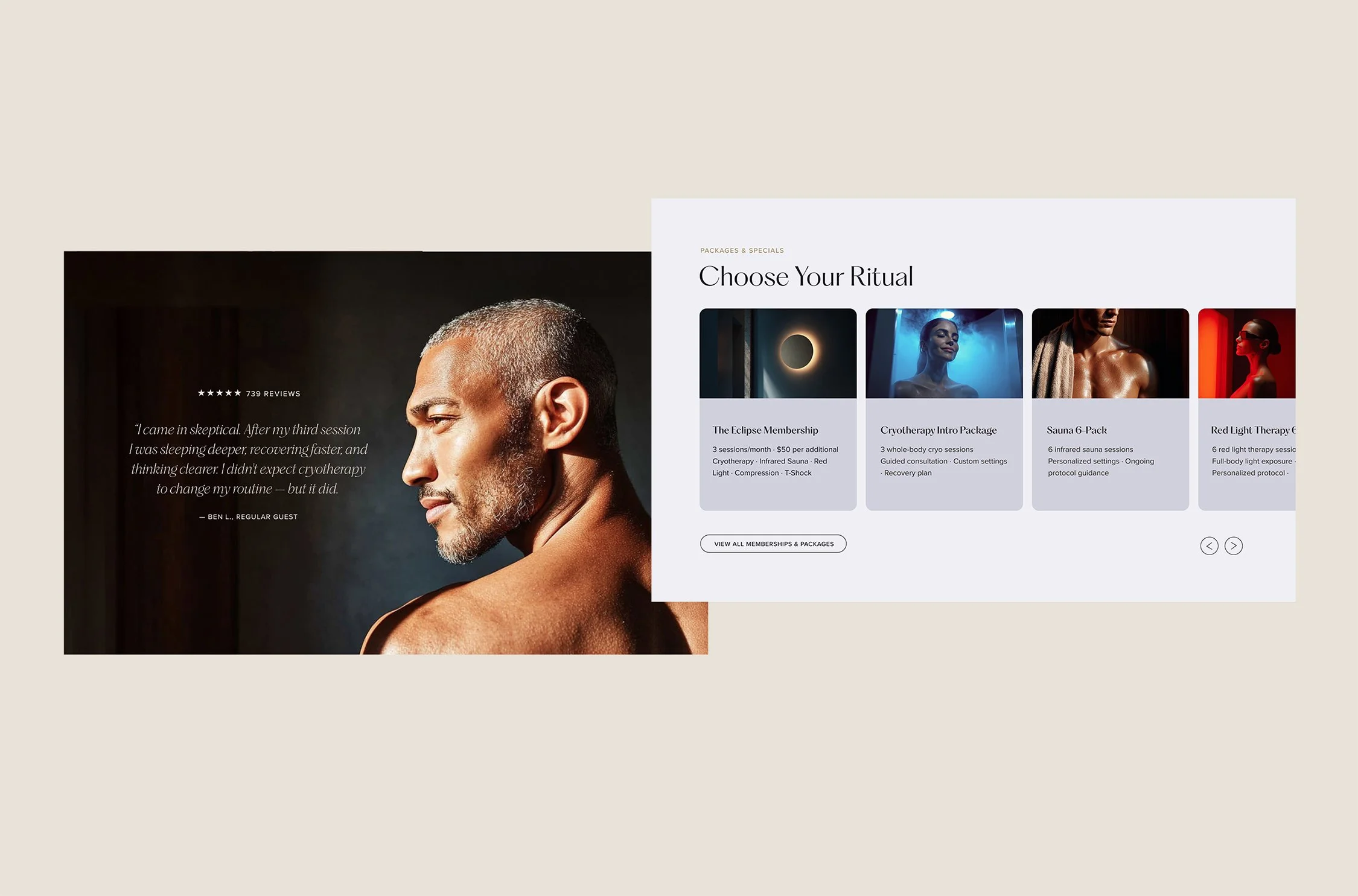
The experience begins in darkness and gradually emerges into light, echoing the eclipse motif as visitors scroll. Photography, typography, and color work in harmony to make the brand immediately felt.
Landing Page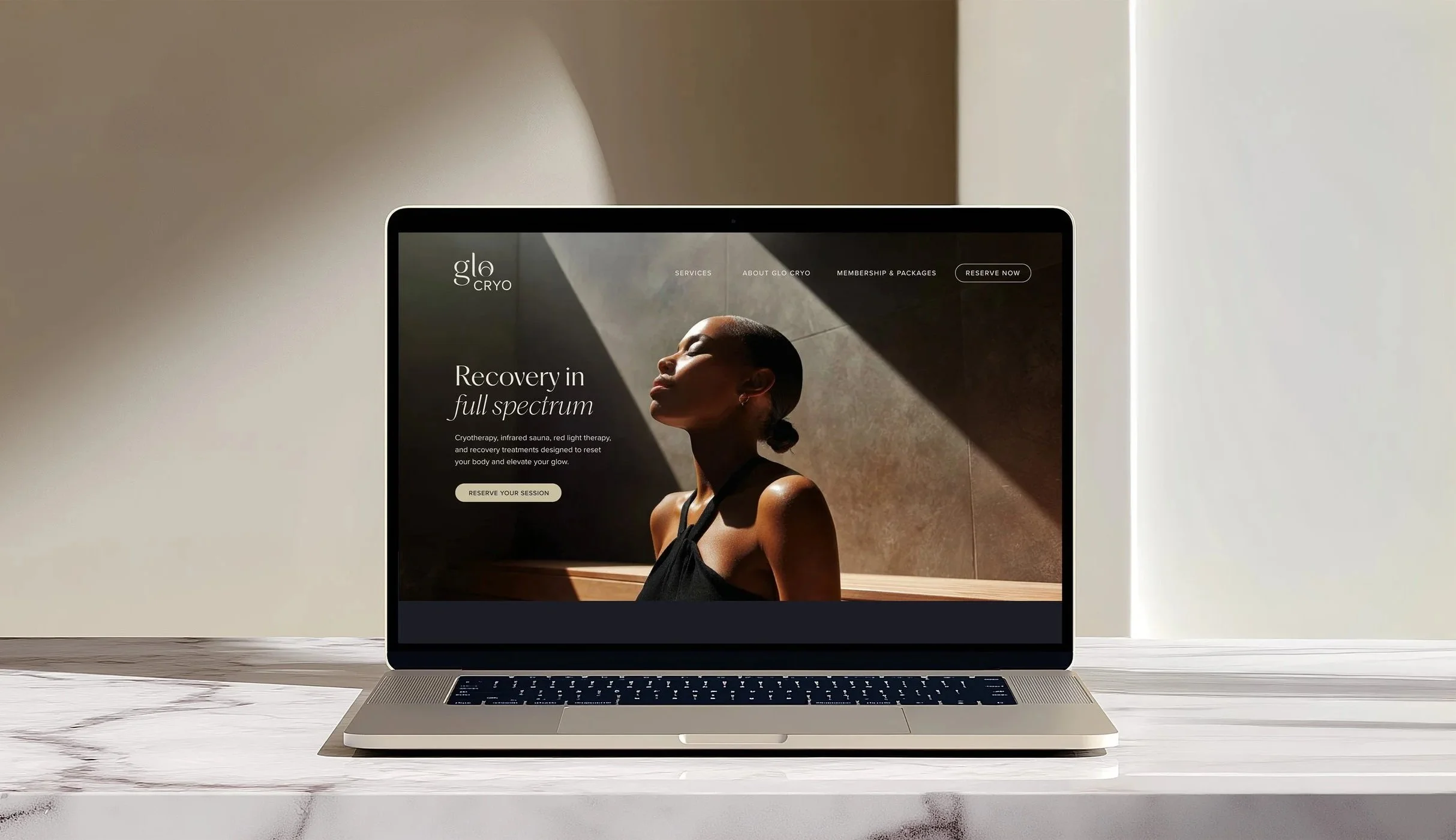
Logo and core identity were produced for a freelance client. Brand extensions shown are spec.